Sunday, February 15, 2009

Movies of the week


Eastwood's triumphant return to bad ass-ness. Social importance, brooding violence, clint eastwood singing with jamie cullum. What more could I want?

One of the greats of it's time. A modified life re-cap for baby boomers. Good stuff.


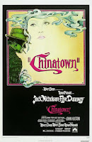
I loves me a good noir film. Maybe it's just that I'm into that L.A. deco style, or just that I can't help but chuckle thinking about the joker as a private dick.

Feel gooder for the week, and suitable replacement for "memorable quotes" movie, if you ever get sick of princess bride.


Amelie (Cinematography)

First let's start by differentiating cinematography from art direction, at least along my lines; and by "my lines" I mean the red line. I see art direction as a mostly "in front of the red line" gig, and cinematography as nearly strictly behind. Cinematography, for me, consists of camerawork (angles, shot composition, camera motion etc., and post-visual (coloring, etc.)
I'll start with shot composition.
The visual story of this film dealt very heavily with faces; it seemed like every few minutes if not more frequently there was a tight and near-centered one shot of some one's face as they reacted to something. Tight shots like this are usually designed to focus blatant attention on things, reacting faces in this case. These "little things" are a huge focus in the movie and pointed out ever so bluntly in these shots.
I was also particularly intrigued by the shot in Amelie's father's garden, with the gnome.
There are many cases in the movie where the camera seems diminutive to the subject, but none so noticeable to me as in this shot. It strikes me like something out of the lord of the rings, when the fellowship assembles for the first time. The humans both kneeling, rooting in the dirt at his feet and the gnome stands proud and tall above them (or at least it looks that way.) This could be in reference to the change he will eventually inspire in his owner, or simply an indication of how boring and pitifully mundane amelie and her father feel at the moment, while the gnome is enjoying his first freedom in years (he'd been cooped up in the shed forever.)
There is a big contrast in this piece in concern to camera motion. Often it's slow and easy, comfortable if you will. This is ideal for highlighting the "simple things" theme. But often the camera moves quite fast, even (while on the train) nauseatingly fast and jumpy. This is, to me anyway, just another little 4th wall breech that brings you back into the realization that this is "just a story," so don't get too worked up over it. While the Amelie herself often looks directly into camera as if to chuckle at an inside joke she has with the audience, this bit of out of place camera work makes the more astute observer say "what the hell was that?" Almost like the cinematographer is playing with us, saying "I like the way your head bobs around on the cross-town train." or "we know she's got the key, but that mean old grocery store owner never will, will he?"
Now to post production go we.
And I will admit that this is a fudged line, but I think coloring in post is really a cinematographer's job over an art director. It's his/her shot, he/she should have complete control over how it looks.
This is a very colorful movie, but not like fireworks are colorful, or flowers are colorful. The colors in this movie are very subdued, or mellowed; almost as if there is no such thing as pure white. Almost like the camera is wearing sunglasses. I guess this could suggest the more relaxed attitude the film puts forth, but I'd be lying if I said I really solidly believed that.
Also many of the character's homes seem to have characteristic colors. Red for Amelie, green for the grocer, orange-ish for the landlady. I'm sure this relates to their personalities, and If I really wanted to I'm sure that site you showed us last week would tell me all about it.
There's my observations on cinematography in Amelie, or at least what I've got for now.

Tuesday, February 10, 2009

Jesse's Movies of the Week

Time for a new tradition: Movies of the week get their own post from now on. So Bah! (no worries, the art direction assignment is down there too)


First time I watched "Contact" I fell asleep, not because I was tired, but because Jodi Fosters journey to space was like a frickin lullabye for the eyes. Way cool.

Tim Burton's fairy tale about fairy tales is, as all of his movies are, a visual masterpiece, and a great story to boot. Ewan McGreggor's tall tale tellin dad dies, but it turns out, maybe they weren't such tall tales after all.

This adaptation of Homer's Oddessy is set in the dust bowl south. Escaped con's seek a treasure that really doesn't exist. Rich with music, great visual design (the first to be entirely color corrected digitally) laughs and story, this is actually my feel good-er in a week full of feel-gooders.


Please Please Please Please show this in class before you ever let anyone think they can make a movie. If Tombstone is candy for the eyes, this is tequila and wild turkey strained through used coffee filters. Absolute rot-gut. Very little attention to detail, cowboys with earrings, bad color correction, and terrible special features. Exactly what NOT to do.

Monday, February 9, 2009

Art Direction via "American Beauty" and "What Dreams May Come"


American Beauty

How important is the set or location to the overall effect of the film?

The setting of a story, especially this story, is nearly, if not equally as important as any of the characters. Here the setting (the pleasantly oblivious suburban neighborhood where the Burnhams live) is something we can all relate to. This universe of normality is exactly where we all live (if not actually, then vicariously through decades of sit-coms and soap operas.) Without even hearing Lester's voice, we would know that he is us, this story is about YOU, and ME.

Why do you think this film is shot on this set or at this location? (many movies have one central set and other minor ones. Focus on the main set. If there are many locations, choose one or two of those locations and focus on them.)

As I said earlier, the location of this film sets the groundwork for our connection to the characters, and to the story.

What is the art director trying to tell you with the costumes chosen for the characters?

Lets look at the contrast between Jane and Angela. In their streetclohtes anyway. Angela's clothes are always colorful, flamboyant, and quite a bit sluttier. Her extremely external locus of confidence defines the way she dresses as totall as it defines the way she acts. Jane's attire on the other hand reflects her personality, subdued by the oppresively boring and embarrassing family she has to come home to every day.

Lester's clothes reflect his journey to happiness. In the beginning his clothes are stuffy, tight, motion limiting, formal and uncomfortable. As he discovers and lets go of how really pointless all of the responsibility and expectation of his life is, his clothes begin to be more about making him happy than making others happy, or showing others that he is happy.

Is the lighting for the film appropriate? Why/why not? Is it harsh and direct or is it soft and diffused (or somewhere in the middle)?
Explain the lighting.


Every scene obviously has it's own unique lighting design chosen to reflect or support the mood of the scene. For instance, the Kiss scene between Lester and Frank. At first, the single garage light looks like an interrogation lamp. Like Frank really is going to do exactly what we think he's going to do. But as soon as he starts to lean in close to Lester, it's obvious that it really was designed for intimacy rather than focused anger.

What is the director trying to tell you with the style of lighting chosen?

Art is really all about feeling. The look of a movie, a scene, a shot, even a single frame is a matter of visual art. Each scene and shot have a specific job in supporting, if not telling the story. The lighting of each scene and shot in this movie excellently mirror the dynamics and flow of the story of Lester Burnham and his friends and family. From the dully lit desaturated veneer of "contention" yearning to latch on to the bright red of the flowers, to the vibrant and pronounced oranges of Lester's uniform at the burger joint where he can finally be happy again, lighting shows us just exactly how we're supposed to see what it is we're seeing.

What colors are prominent? Why? What message is being sent?

The article talks a lot about red being symbollic of life, happiness, etc. This is evident in that everything Lester, and in fact, all the characters really truly want is vibrantly red. Wether that be a red sports-car, or the lips of a beautiful young girl for Lester, or the man on the bright red real estate sign for Carolyn.

Other comments:
I noticed several times the way shots were composed, especially early in the film, Lester felt to me like he was hanging. In their first dinner scene, the table is closer to one wall than the other, with Carolyn nearer the closer wall. This leaves Lester just "hanging" in the middle of the room, too far from any point of reference to be really noticed, not really in the middle of the shot, but not really on a third either. He's just kind of "there even though he doesn't really need to be."

I also wanted to comment about the use of the camcorder footage Wes Bentley (Ricky Fitts) comments on the special features that he thinks the video camera serves as sort of a more precise eye that looks without bias at what most people take for granted. Though the cinematography of the film was gorgeous, they chose to use quite a bit of camcorder footage. I think this really does give a sense of reality and relatability to whatever the camcorder looks at.


What Dreams May Come

How important is the set or location to the overall effect of the film?

There are many sets in this movie, and I don't really think any one could be called the "main set or location." One that I'd like to focus on however recurs in the movie, like musical variations on a theme: The Mountains. I suppose it could have to do with the fact that many of the scenes in this movie were filmed in my dear old Montana.
The mountains represent, to me, in all their permutations and variations, the sheer majesty and grandeur of the theme at that time. In the beginning it's Chris and Annie's love, when Chris goes to heaven, it's the boundless capacity of his imagination to extrapolate from what he loved in life, when he seeks his love again, it's the obstacle before him.

Why do you think this film is shot on this set or at this location? (many movies have one central set and other minor ones. Focus on the main set. If there are many locations, choose one or two of those locations and focus on them.)

As I said above, these scenes were shot in the Rocky Mountains of Montana, and digitally altered for their appearance in heaven. The live shots had to be grand and majestic to work, and I'm guesing the budget people said Montana was a better option than Switzerland.

What is the art director trying to tell you with the costumes chosen for the characters?

Initially their clothes represent their youth, but as they grow, their individual personalities and cardinal traits become infused with their garb. Annie's clothes are constantly changing, constantly fading little by little to the dark side, following her into depression as she loses everything she loves. Chris on the other hand is Mr. stability. His costume remains relatively the same throughout his adult life, strong but warm. Annie depends on this, and Chris's pride and joy in life is his ability to stand up under his ailing wife and support her in her time of need.

Is the lighting for the film appropriate? Why/why not? Is it harsh and direct or is it soft and diffused (or somewhere in the middle)? Explain the lighting.

Here I must admit that this movie is clearly above my level in terms of artistic interpretation. The subtext of fine art in the visual nature of this movie is really designed for those who have studied art, and know what their looking at. For the rest of us, let it suffice that we can just look it and go "oooo pretty."
In any event, I will say that on a basic level, the lighting in this film really follows Annie in the real world, and Chris's heart in his heaven. These two merge in the confrontation of Chris and Annie(post suicide.) Chris has found his children, and realized finally how much their death affected Annie, and that he was too pre-occupied with trying to bring her back to him to notice. He knows now just how bad it was for her, and knows even still (here's where the beauty of this scene comes from) that he'd rather live in that grey, dead, mournful, lost and perpetual hell with Annie than in his own vibrant, colorful happy heaven without her.

What is the director trying to tell you with the style of lighting chosen?

I think he's using lighting as a contrast, mostly between happiness and sadness (fulfilment and emptiness, etc etc.) Brightness and color equate to positivity, hope, etc. Desaturated, grey low wash-lighting equate to sadness, depression, damnation, etc.

What colors are prominent? Why? What message is being sent?

Here again I can only say that any attempt on my part to analyze color in this movie would be little short of pointless. There is so much color which I'm sure references so many different classical artists, paintings, statements, etc. that I'd be remiss in assuming I could accurately decipher just what the production team had in mind.
There is however a recurrence of that sort of cornflower blue-violet in the tree. I think this is sheerly due to it's connection with the tree itself, but it seems to represent the ethereal link between Chris and Annie, maybe that's the color of true soul mates, maybe it's their individual "wavelength." In any case it seems to represent their higher connection, above and beyond love and companionship.

Other Comments

I think animated films, and films that incorporate heavy artificial graphics often tend to be somewhat caricature-ish in art design. This isn't always a bad thing though, in fact I think it's what makes Disney movies interesting to watch. This film however not only uses a ton of C.G.I. but it does it without seeming gratuitous. It's like a movie with a fantastic score that you don't even remember. The story of "What Dreams May Come" is so powerful, that the imagery seems like it's just barely keeping up, it makes it very easy to get lost in Chris's imagination.

Sunday, February 1, 2009

Good Will Hunting

We talked about stories this week, what makes a good story, what intrigues us as human beings. We talked about characters, plots, etc. What we didn't talk about is one of the elements of a story that intrigues me most, contrasts and compromises. And that, I think, is what Good Will Hunting is all about, the contrast between Will's amazingly vast genious, and his inability to participate in the most basic of human relations most of us take for granted. Will can recite, remember, extrapolate, and prove anything academic, things most would deem very difficult. But when it comes to loving someone, trusting someone, or believing in himself, he's crippled.

I think the characters in Will's life represent his future:

Professor Lambeau is Will's easy path. The academic future is obviously easy for Will, it requires no extra effort, provides a path to fame, financial security, and success. But more importantly, to boredom, to self-loathing. Professor Lambeau seems to have some of the same issues Will has. His relationships with women are at best short-lived, his relationships with his friends and colleagues are less than desireable, he seems to be just what Will hopes not to become.

Chuckie Sullivan is Will's current path. He's stuck in a dead end job where it's not WHAT you know, it's WHO you know. This is no advantage to Will. He lives where he's always been comfortable, welcome, safe both physically and emotionally. There is nowhere to go, but at least he won't be bored. He could stay in Boston the rest of his life and never want for anything emotionally.

Skylar is the emotionally capable path. She represents both what Will truly wants, and what Will truly wants to be. This path is the only path that makes Will grow, and thus, the path that is the hardest.

Sean is the path of a failed attempt. The articles talk about Sean as a flawed soul, a lost man who needs Will's help as much as Will truly needs his, but I disaggree slightly. In one scene, Sean scolds Will for being too scared to try, too afraid to let something besides his intelligence take over for a while, and Will fires back, saying Sean is afraid to try again, incapable of picking up the pieces and eventually finding peace. This is what really scares Will. This is why he doesn't want to ty in the first place. If he tries and fails he'll be just like Sean; incapable of trying again, of making something better when it fails. Will can't move on until he realizes that there is redemption after failure. Therefore I believe Sean is the ultimate hero of the movie. He must save Will, but in order to save Will, he must save himself. Will's "it's not your fault" breakthrough is visually and emotionally powerful; he's finally let go of the circumstances that put him where he is, but that only allows him to be ok with the easy path. It's not until Sean overcomes his own inabilities that Will has the courage to go after what he really wants.

In the Ziewacz article, Will's Coming of age is highlighted and I'm less than taken in. I think this is a bit of stretch, but perhaps that's due to my relative unfamiliarity with Catcher in the Rye and Portnoy's Complaint. There may be elements of social growth, and they may or may not relate to archetypal stories, but I think we need to keep in mind that this was written by college students. This kind of inherent "growing up" feeling seems natural in a story written by, and for a twenty something.


Jesse's Movie's of the Week


Lucky Number Slevin - This is a murder mystery-mystery-ish movie. Stylish and fun to watch, though maybe a little over-budgeted in the cast. I would've liked to have seen Hartnett be the big name. Freeman and Willis are just a little over-kill I thought.


The Usual Suspects - If you noticed, this was supposed to be in my list last week, but I must've forgotten the picture and thoughts. This is a thinking man's movie, don't blink, you'll miss the plot.


What Dreams May Come - Robin Williams is amazing in this visually stunning answer to the question "what is heaven like?" This could be dismissed as "panty remover," and it's definitely better when watched with a member of the feminine persuasion, but there's so much more. This is my feel-gooder for the week.

Followers